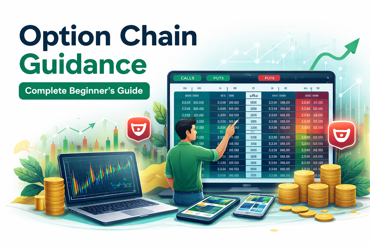
How to Read Option Chain Data
for NIFTY Trading
The option chain is one of the most powerful data sources available to Indian options traders — but most beginners have no idea how to read it. They see a wall of numbers and either ignore it entirely or draw the wrong conclusions. This guide teaches you exactly what each column means, which data points actually matter for NIFTY trading decisions, and how Stoxra's built-in option chain tool makes this analysis faster, clearer, and more actionable than reading raw NSE data alone.
Table of Contents
Section NavigationBest next step: open a free Stoxra account and explore the live NIFTY option chain with highlighted OI levels, volume bars, and AI-powered insights.
Quick Answer
The NIFTY option chain is a table showing all available call and put options across different strike prices, along with open interest (OI), change in OI, volume, implied volatility (IV), and premium. To read it effectively, focus on three things: where OI is concentrated (these become support and resistance zones), whether OI is building or unwinding (this shows fresh positioning), and how IV compares across strikes. Stoxra's built-in option chain shows all of this in a clean, beginner-friendly layout — and Stoxra Premium adds PCR trends, max pain levels, and AI alerts that flag when institutional positioning shifts.
What Is the Option Chain and Why Should Every NIFTY Trader Read It?
The option chain is a live data table published by the exchange that shows every active options contract for a particular underlying — in this case, NIFTY. It displays calls on one side and puts on the other, with the strike price column running down the center. Each row gives you data about that specific strike: how many contracts exist, how many traded today, what the premium costs, and what the market expects volatility to be.
For beginners, the option chain can look overwhelming. Dozens of columns, hundreds of rows, numbers changing every second. But you do not need to understand every column. You need to understand a few key data points and what they mean for your trading decision. This guide focuses only on what actually matters for a beginner NIFTY trader.
Think of the option chain as a map of where smart money is positioned. Large institutions and professional option sellers leave footprints in the data. Heavy open interest at a strike price tells you where the big players expect the market to stall. Changes in that open interest tell you whether those positions are growing or closing. This is information most beginners ignore — and it is exactly the information that gives you an edge.
Map of market positioning
Option chain data shows where big players have placed their bets — giving you clues about likely support and resistance.
Sentiment indicator
The balance between call OI and put OI tells you whether the market leans bullish, bearish, or neutral.
Real-time intelligence
Unlike chart patterns that look backward, the option chain shows you what is happening right now in terms of fresh positioning.
Stoxra advantage: instead of parsing raw NSE data in a cluttered table, Stoxra's option chain tool presents the same data in a clean visual layout with automatic OI highlighting, making it far easier for beginners to spot the levels that matter. Try it free →
Anatomy of the NIFTY Option Chain: Every Column Explained Simply
Before you can use the option chain for trading, you need to understand what each column actually means. Here is a beginner-friendly breakdown of the most important columns.
| Column | What it shows | Why it matters for trading | Stoxra display |
|---|---|---|---|
| OI (Open Interest) | Total number of active contracts at that strike | High OI = strong support/resistance zone. This is the most important column for beginners. | Highlighted bars with color intensity |
| Change in OI | How much OI increased or decreased today | Positive change = fresh positions building. Negative change = positions unwinding. | Green/red change indicators |
| Volume | Number of contracts traded today | High volume confirms active interest at that strike. Low volume suggests weak conviction. | Volume bars alongside OI |
| IV (Implied Volatility) | Market's expectation of future price movement | Higher IV = higher premium. Useful for deciding whether options are expensive or cheap. | IV column with percentile reference |
| LTP (Last Traded Price) | The most recent premium price of that contract | This is the cost of buying the option. Combined with OI and volume, it tells the full story. | Live premium display |
| Strike Price | The price level the option represents | The center column. ATM (at-the-money) strikes are highlighted. ITM and OTM are on either side. | ATM auto-highlighted with marker |
As a beginner, the three columns that matter most are OI, Change in OI, and Volume. If you understand just these three, you can already make better trading decisions than most retail traders who trade options blindly based on tips and charts alone.
Open Interest: The Most Important Number in the Option Chain
Open interest is the total number of outstanding contracts at a specific strike price that have not been closed or settled. It is not the same as volume. Volume counts how many contracts traded today. Open interest counts how many positions are still open. This difference matters because OI shows commitment while volume shows activity.
Here is how to use OI as a beginner NIFTY trader. Look at the put side first. Find the strike price with the highest put OI. This level often acts as strong support because a large number of put sellers are positioned there, and they expect NIFTY to stay above that level. Now look at the call side. Find the strike price with the highest call OI. This level often acts as strong resistance because call sellers expect NIFTY to stay below it.
The range between the highest put OI strike and the highest call OI strike gives you the expected trading range for NIFTY. This is one of the simplest and most useful insights you can get from the option chain, and it takes less than thirty seconds once you know what to look for.
Rule 1
High Put OI = Support Zone
Put sellers have committed capital at this strike. They expect NIFTY to stay above it. If this level breaks, it often triggers fast movement because those positions get squeezed. Stoxra's option chain automatically highlights the highest put OI strike so you do not have to scan manually.
Rule 2
High Call OI = Resistance Zone
Call sellers have committed capital at this strike. They expect NIFTY to stay below it. A breakout above this level with OI unwinding confirms bullish momentum. Stoxra highlights this zone with color-coded bars on the free tier.
Rule 3
Change in OI = Fresh Positioning
If OI increases at a strike with rising price, new bullish positions are being built. If OI increases with falling price, new bearish positions are being built. Stoxra Premium tracks change-in-OI trends across multiple sessions so you can see institutional accumulation over days, not just one snapshot.
See OI Levels Highlighted Automatically
Stop scanning raw NSE data. Stoxra's option chain tool highlights support and resistance zones based on live OI data — free on every account.
Volume and Implied Volatility: The Context That Completes the Picture
Open interest tells you where positions exist. Volume tells you how actively those positions are being traded today. And implied volatility tells you how expensive or cheap the options are relative to what the market expects.
Volume confirms conviction. If a strike has high OI and high volume, the level is actively being defended or built upon. If OI is high but volume is low, the positions may be old and stale. For intraday NIFTY traders, volume spikes at specific strikes often signal fresh institutional activity that can move the market toward or away from that level.
Implied volatility (IV) tells you the cost of the option relative to expected movement. When IV is high, premiums are expensive — which means option buyers need a bigger move to profit. When IV is low, premiums are cheap and smaller moves can be profitable. Beginners often overpay for options because they do not check IV before entering. Stoxra shows IV alongside each strike, and Stoxra Premium provides IV percentile rankings so you can quickly see whether current IV is high or low relative to recent history.
| Scenario | OI | Volume | IV | What it suggests |
|---|---|---|---|---|
| Strong support | High put OI | High put volume | Moderate | Active defence of this level. Sellers are confident. |
| Breakout building | Call OI unwinding | High call volume | Rising | Call sellers closing positions. Resistance may break soon. |
| Expensive option | Any | Any | Very high | Premium is inflated. Buyer needs large move to profit. Consider selling strategies. |
| Cheap option | Any | Any | Very low | Premium is deflated. Good for buyers if a big move is expected. |
PCR Ratio: The Simplest Way to Gauge Market Sentiment from the Option Chain
PCR stands for Put-Call Ratio. It is calculated by dividing total put open interest by total call open interest. This single number gives you a quick read on overall market sentiment for NIFTY.
A PCR above 1.0 generally signals bullish sentiment. This may sound counterintuitive, but a high PCR means more puts are being written — and put writing is a bullish bet because the seller expects the market to stay above the put strike. A PCR below 0.7 generally signals bearish sentiment because call writing is dominating, and call sellers expect the market to stay below the call strikes.
The extremes are also useful. A very high PCR above 1.3 to 1.5 often indicates extreme bullishness, which can sometimes precede a pullback. A very low PCR below 0.5 indicates extreme bearishness, which can sometimes precede a bounce. Experienced traders use PCR as a contrarian indicator at extremes.
Above 1.0
Generally bullish. More puts being written means sellers expect the market to hold or rise. Standard readings during healthy uptrends.
0.7 – 1.0
Neutral to mildly cautious. Balanced positioning between call and put sides. Market may be range-bound or undecided.
Below 0.7
Generally bearish. Heavy call writing suggests sellers expect the market to stay low. Can also appear near market bottoms as a contrarian signal.
Live PCR Trends & Historical Comparison
Stoxra Premium displays the PCR ratio in real-time and tracks how it changes throughout the day and across sessions. Instead of calculating PCR manually from raw OI data, you see a live trend line that shows whether sentiment is shifting bullish or bearish — with alerts when PCR hits extreme levels. This feature alone saves time and prevents the common beginner mistake of misreading a single-point PCR without context.
Max Pain: Where NIFTY Tends to Settle Near Expiry
Max pain is the strike price at which the total value of all outstanding call and put options expires worthless, resulting in the minimum payout from option sellers. In simpler terms, max pain is the level where option sellers collectively lose the least money.
The max pain theory suggests that NIFTY tends to gravitate toward this level as expiry approaches, especially in the final two to three days. This happens because option sellers — who are often large institutions — have an incentive to keep the index near the level that costs them the least. While max pain is not a perfect predictor, it provides a useful anchor point for your expiry-week trading decisions.
Calculating max pain manually requires adding up the intrinsic value payouts for every strike on both the call and put side, which is tedious. Stoxra Premium does this calculation automatically and overlays the max pain level directly on the option chain view. You see the number instantly without any manual work. For beginners who trade weekly NIFTY expiries, this one feature can meaningfully improve strike selection and exit timing.
How to use max pain: if NIFTY is trading significantly above or below the max pain level with two days to expiry, there is a statistical tendency for it to move back toward max pain. This does not mean it always happens, but it adds a useful data point to your analysis — especially when combined with OI and PCR data. Stoxra Premium shows all three together in a single view.
Step-by-Step: How to Read the NIFTY Option Chain Before Placing a Trade
Here is a practical workflow you can follow every time you open the NIFTY option chain on Stoxra or any other platform. This sequence turns raw data into actionable trading insight in under five minutes.
Identify the ATM strike
Find the at-the-money strike — the strike closest to the current NIFTY spot price. Stoxra highlights this automatically. This is your anchor point. All analysis radiates outward from here.
Find the highest put OI and highest call OI
Scan the put side for the strike with the largest open interest. That is your support zone. Scan the call side for the highest OI. That is your resistance zone. The range between them is the expected trading range. On Stoxra, these are visually highlighted with bar charts.
Check change in OI
Are positions building at those levels (positive change) or unwinding (negative change)? Building OI means the level is getting stronger. Unwinding OI means the level is weakening and a breakout may follow.
Check volume at key strikes
High volume at high-OI strikes confirms active participation. Low volume at high-OI strikes means the positions may be old and less reliable as current support or resistance.
Note the overall PCR
Is the market leaning bullish (PCR above 1.0) or bearish (below 0.7)? This gives you the directional context before choosing your trade direction. Stoxra Premium shows PCR with trend context.
Check IV before buying an option
If IV is elevated, premiums are expensive. If IV is low, premiums are cheap. This determines whether buying or selling strategies are more favorable. Stoxra displays IV alongside premium for every strike.
This six-step process gives you a complete picture in under five minutes. Beginners who follow this workflow consistently make better-informed decisions than traders who enter positions based only on chart patterns or tips. Combine this with the Bank NIFTY option chain guide for a more comprehensive options analysis routine.
Common Mistakes Beginners Make When Reading the NIFTY Option Chain
The option chain is powerful, but it is easy to misread if you do not know what to watch for. Here are the most common mistakes beginners make — and how to avoid them.
Ignoring the option chain entirely
Many beginners trade options using only chart patterns without ever looking at OI or volume. They are missing the most useful data source for strike selection and direction.
Treating OI as a guaranteed level
High OI creates a probable zone, not a wall. It can break. Always use OI alongside price action and volume, not as a standalone signal.
Confusing volume with OI
Volume is today's activity. OI is the total position. A strike with high volume but low OI is getting attention today but may not hold as a level tomorrow.
Not checking IV before buying
Buying when IV is extremely high means overpaying for the option. Even if direction is correct, premium decay from IV crush can turn a winning trade into a loss.
Looking at one snapshot only
A single OI reading is useful, but tracking how OI changes throughout the day gives far richer information. Stoxra Premium tracks multi-session OI changes automatically.
Overcomplicating the analysis
Beginners often try to analyze every strike and every column. Focus only on the 5–7 strikes closest to ATM and the three key metrics: OI, change in OI, and volume.
How Stoxra Makes Option Chain Analysis Faster and Smarter for Beginners
Reading the raw NSE option chain is like reading a spreadsheet with no formatting — technically all the data is there, but finding the important numbers takes time and experience. Stoxra's option chain tool is designed to solve this by presenting the same data in a visual, beginner-friendly format that automatically highlights the levels and patterns that matter most.
Built-In NIFTY & Bank NIFTY Option Chain
Live OI, volume, IV, and premium for every strike. No need to switch between NSE and your trading screen.
Try it free →Auto-Highlighted OI Zones
Highest put OI and call OI strikes are visually marked with color bars so you see support and resistance instantly.
See OI zones →AI Mentor Analysis
Stoxra's AI explains what the option chain data means in plain language and suggests how it connects to your setup.
Ask AI Mentor →Advanced Charts
Combine option chain insights with technical chart analysis on the same screen. Data-driven decisions, not guesswork.
Open charts →Paper Trading
Practise acting on option chain analysis without real money. Test whether your OI reading translates to profitable decisions.
Practise free →Trade Journal
Record whether option chain analysis improved your entries and exits. Track which OI-based decisions worked and which did not.
Journal guide →Trading Competitions
Apply your option chain skills in competitive simulations. Consistency and smart analysis win more than lucky bets.
Join competition →Market News
Curated news that helps you understand macro events that could shift NIFTY option chain positioning dramatically.
Read news →Read the Option Chain Like a Pro — Starting Today
Create a free Stoxra account and explore the NIFTY option chain with visual OI bars, live premiums, and AI-powered insights. Upgrade to Premium for PCR trends, max pain, OI heatmaps, and automated shift alerts.
Premium Features That Transform Option Chain Analysis
Stoxra's free tier gives you everything a beginner needs. But when you are ready for deeper analysis, Premium unlocks tools that professional traders rely on:
PCR Trend Dashboard — live PCR with intraday trend and historical percentile. Max Pain Overlay — calculated automatically and displayed directly on the chain. OI Heatmap — multi-session OI change visualized as a heatmap so you see institutional accumulation at a glance. AI Shift Alerts — get notified when major OI shifts happen at key strikes during the session. This is the difference between reacting to data and anticipating it.
Frequently Asked Questions
What is option chain data and why is it important for NIFTY trading?
Option chain data is a table showing all available call and put options for NIFTY at different strike prices, along with open interest, volume, implied volatility, and premium. It helps traders identify support and resistance zones, gauge market sentiment, and make more informed entry and exit decisions. Stoxra provides this data in a clean, visual format with auto-highlighted key levels.
How do I use open interest in the NIFTY option chain?
High open interest at a particular strike often acts as a support or resistance zone. Heavy put OI suggests support. Heavy call OI suggests resistance. The range between them gives you the expected trading range. Stoxra highlights these zones automatically on both free and Premium accounts.
What is PCR ratio and how should beginners use it?
PCR is the Put-Call Ratio, calculated by dividing total put OI by total call OI. A PCR above 1.0 is generally bullish. Below 0.7 is generally bearish. Stoxra Premium displays live PCR with trend context and historical comparison so you can see sentiment shifts in real-time.
What is max pain in NIFTY options and how does it help?
Max pain is the strike price where the maximum number of contracts expire worthless, costing option sellers the least. NIFTY tends to gravitate toward max pain near expiry. Stoxra Premium calculates and displays max pain automatically on the option chain view.
Does Stoxra have a built-in option chain for NIFTY?
Yes. Stoxra provides a built-in NIFTY and Bank NIFTY option chain with OI, volume, IV, and change-in-OI tracking. The free account gives core access. Premium adds PCR trends, max pain overlay, OI heatmaps, and AI-powered shift alerts for advanced analysis.
The Option Chain Is Not Just Data. It Is Your Edge — If You Learn to Read It.
Most beginner NIFTY traders ignore the option chain and trade based on charts alone, tips from social media, or gut feeling. That is leaving one of the most valuable data sources completely untouched. The option chain shows you where large players are positioned, where the market expects support and resistance, and whether sentiment is shifting — all in real-time.
You do not need to understand every column. Start with OI, change in OI, and volume. Add PCR and IV once you are comfortable. Use max pain near expiry. Follow the six-step reading process from this guide before every session. And most importantly — practise on Stoxra before real money turns analytical decisions into emotional ones.
Stoxra's option chain tool makes everything easier for beginners by highlighting key levels, displaying live data in a clean format, and letting you combine option chain analysis with paper trading, journaling, and AI-guided review. The free account gets you started. Premium gives you the full analytical toolkit that professionals use.
🔑 Key Takeaway
Learn to Read OI. Spot the Range. Trade With Data, Not Guesswork.
Create a free Stoxra account to explore the NIFTY option chain with visual OI, live IV, and AI insights. Upgrade to Premium for PCR trends, max pain, heatmaps, and automated alerts.
Stoxra Sitemap